
Responsive Web Designing Services
Get a website that works for all devices
Responsive website design is the solution to cater to this requirement. Responsive web design allows the website to alter its layout in accordance with the device that is being used. The layouts
of the pages of the website change according to the capabilities and the specifications of the gadget. An example is a single column and double column. If a mobile phone is being used, the page
and its content may be displayed in the form of a single column. On the other hand, if a tablet is being used, the same content will most probably be displayed in double column.The choice of the
layout to be used to present the page and its content will be decided by something called breakpoints and the width of a web browser determines these breakpoints.
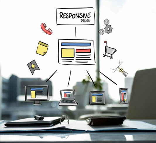
The responsive web design allows the same HTML to serve all the devices which are used to access the website. It is obviously expensive, inconvenient and therefore undesirable to have separate
websites for all the different gadgets that are being used today e.g. big screens, laptops, desktops, phones and tablets. Responsive websites lets a single code base to be used for supporting all
kinds of users with different devices in their hands.It is important to remember that an effective responsive web design is necessary to ensure that the users and visitors do not have any
difficulty in accessing your website. This can only be done by very few experts from the field of web development. We proud to have one of the most experienced and talented teams in the market in
this regard. We are one of the proudest teams of wonderful responsive website designers with us who design responsive websites of the best quality in the market.
Responsive Mobile Compatible Website Design Services Chennai
Responsive website design services offered by us mainly cuts down on development time and cost. It allows you to optimize your business for all the devices with a single website.

